Scandinavian Airlines
Taking Scandinavian Airlines to new heights
Some results since launch:
– From loss in 2014, to 140 million euro profit in 2015
– Brand value increase with 167 million euro
– Willingness to pay increased with 26%
– Return on media investment increased x4
– Price premium up 26% compared to largest competitor
SAS is the leading airline in Scandinavia and one of its strongest and most recognized brands. Nevertheless, over the years it had become visually hard to distinguish from the low price carriers. So based on data on what drives sales, we focused almost entirely on the frequent travellers with the purpose of increasing their willingness to pay premium. This new identity resulted in a transformed SAS and has achieved some truly magnificent results.
Based on data collected by what drives sales we identified and focused on a new target group, the Scandinavian frequent travelers. Meaning those who travel 5+ times per year. This group represent only 12% of the market, but are responsible for a staggering 70% of the airline’s overall revenue. To increase willingness to pay in this group would be extremely profitable for SAS, and that became one of our main goals.
We named our new target group “The True Travelers” and the primary purpose of the new identity was to attract them, by creating a brand and community they would like to be a part of. To succeed the brand needed an upgrade in every sense. We needed to make SAS more premium, aspirational and adapted to our digital age. The new visual identity has helped transform SAS to be perceived as a premium and credible brand whose community the target group want to be a part of. Since launch this has meant an increased willingness to pay by 26%, equivalent to a brand value increase of 167 million Euro.
"Bold has successfully managed to create an identity that unites the entire SAS brand on all platforms and in every channel. Something we have been working towards for a long time."
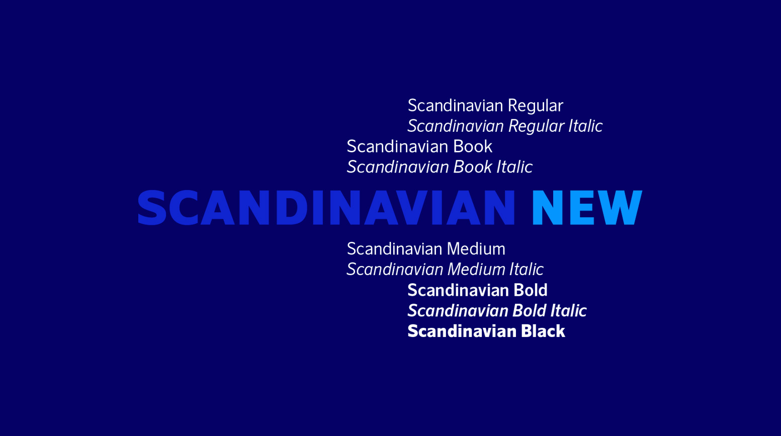
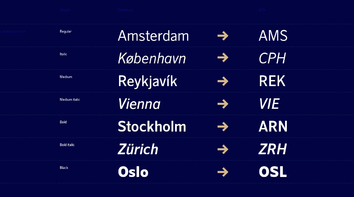
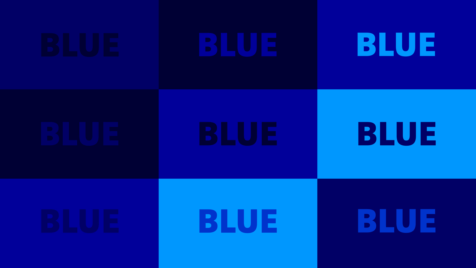
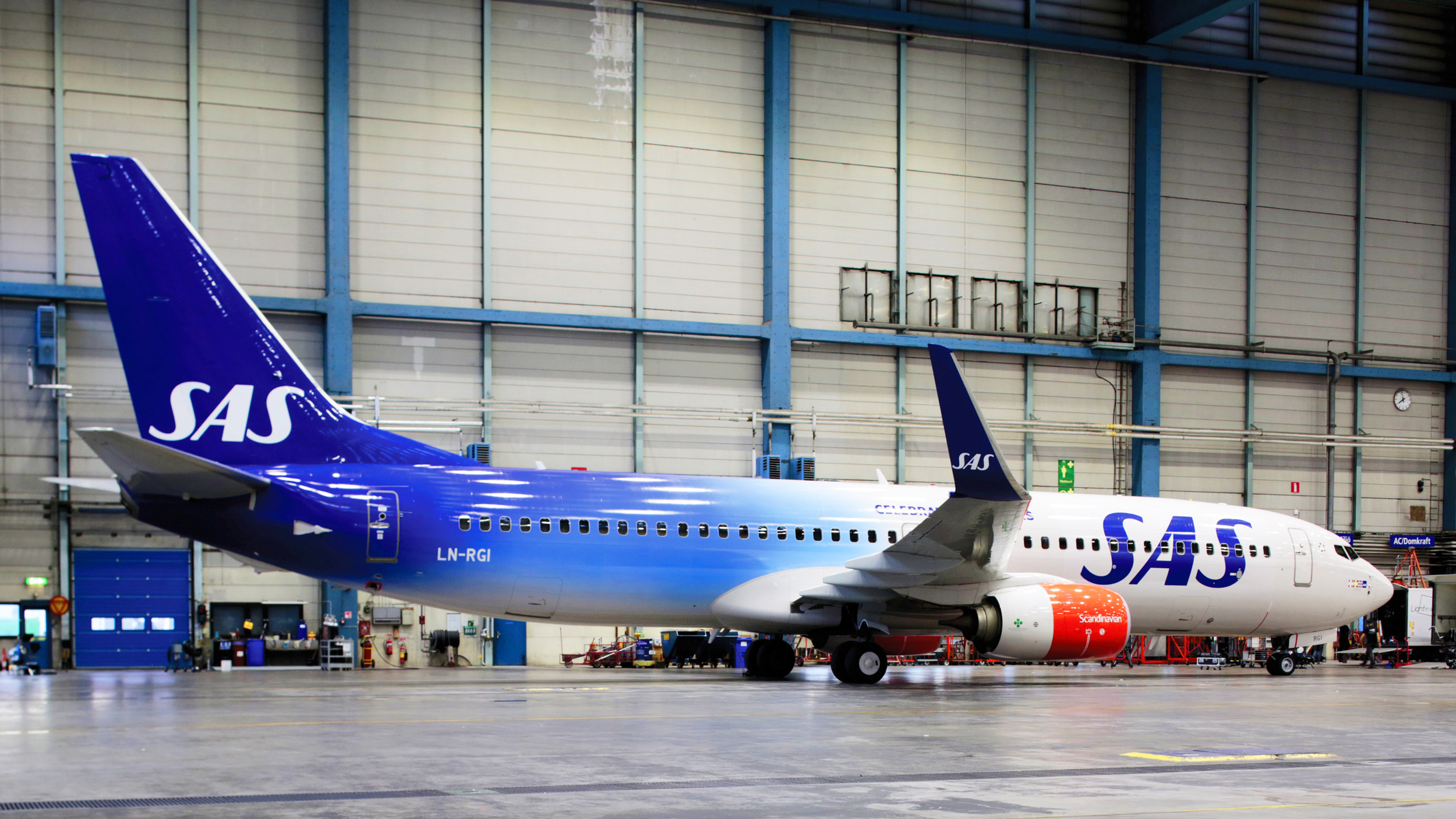
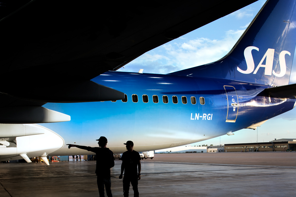
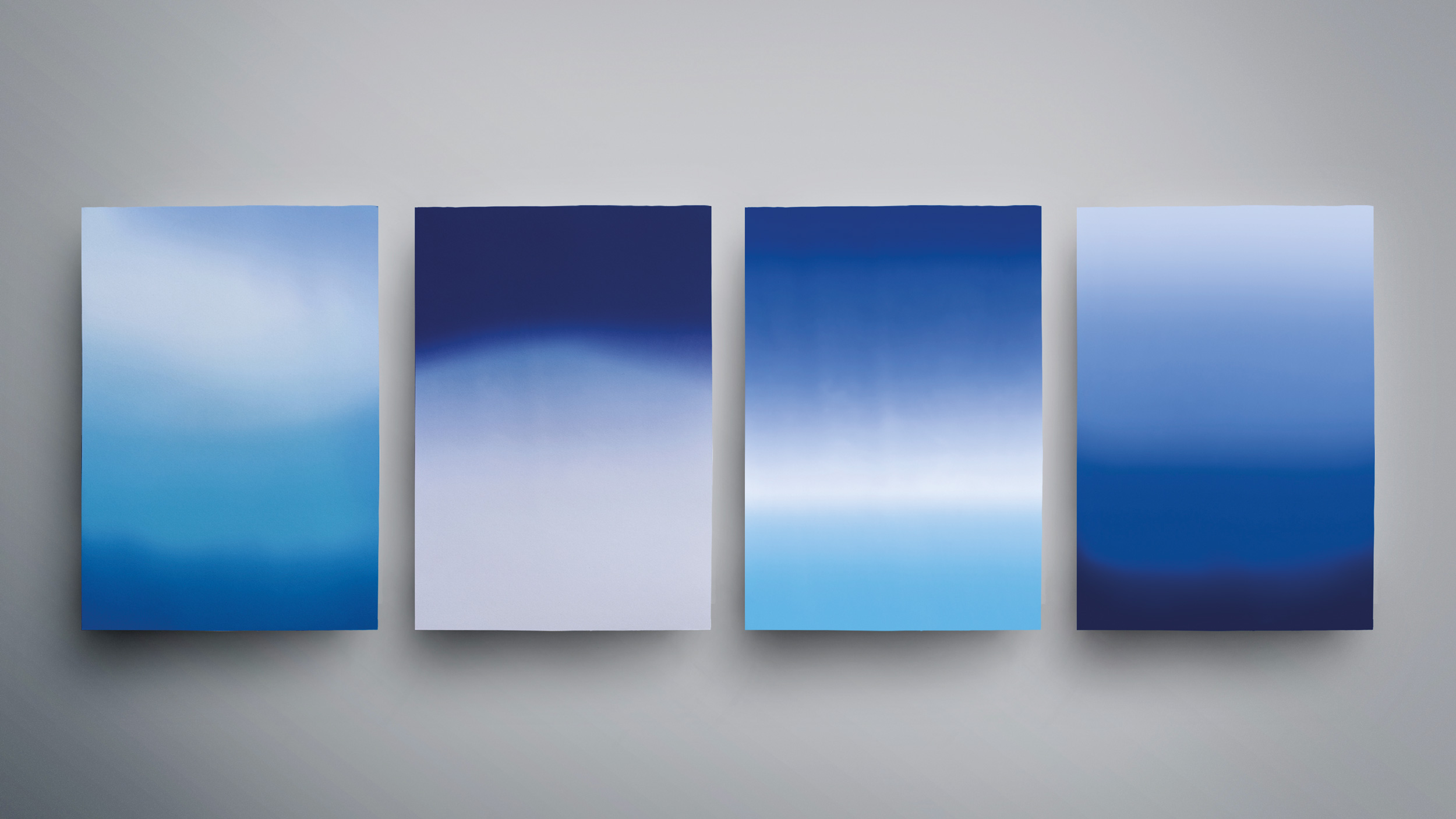
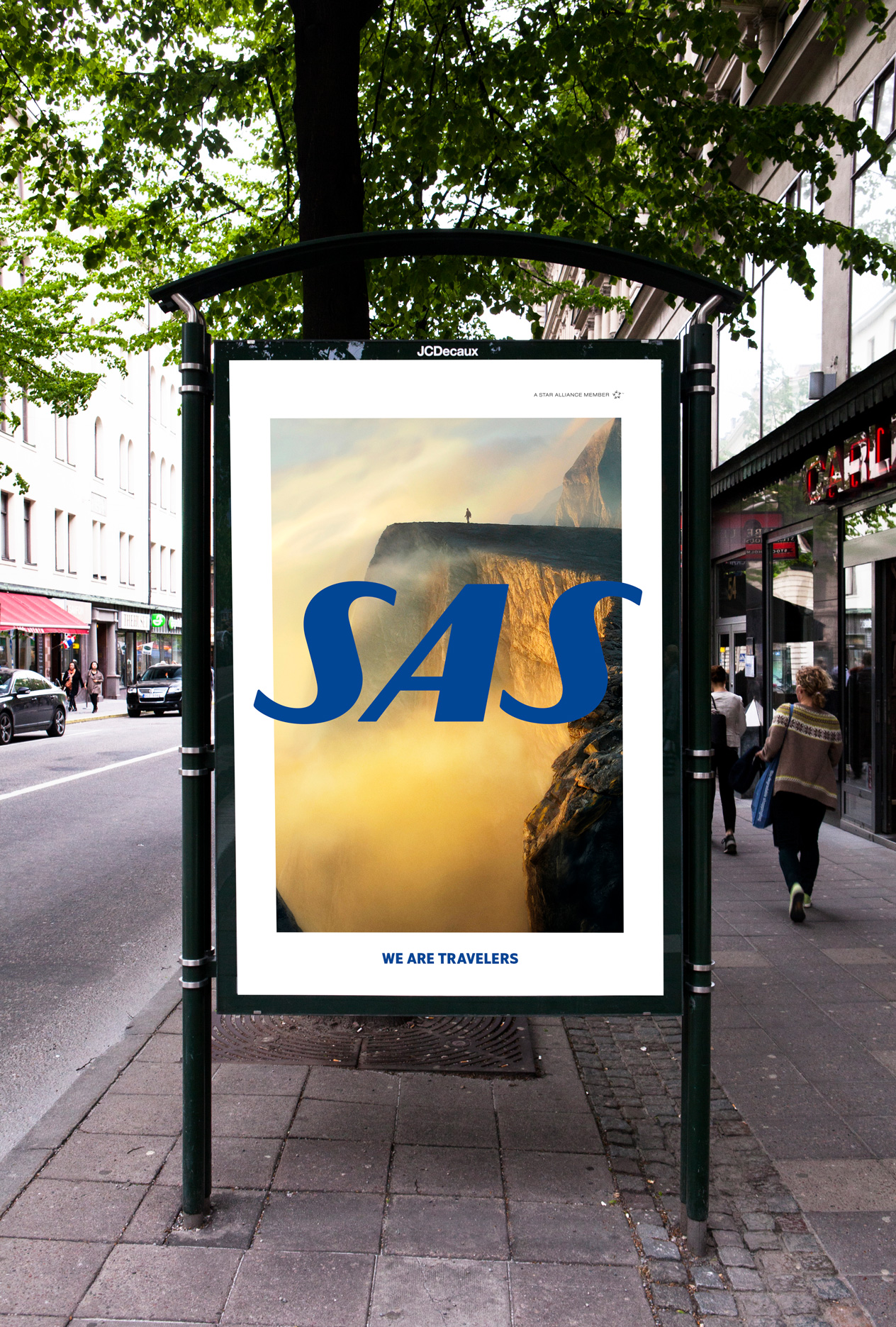
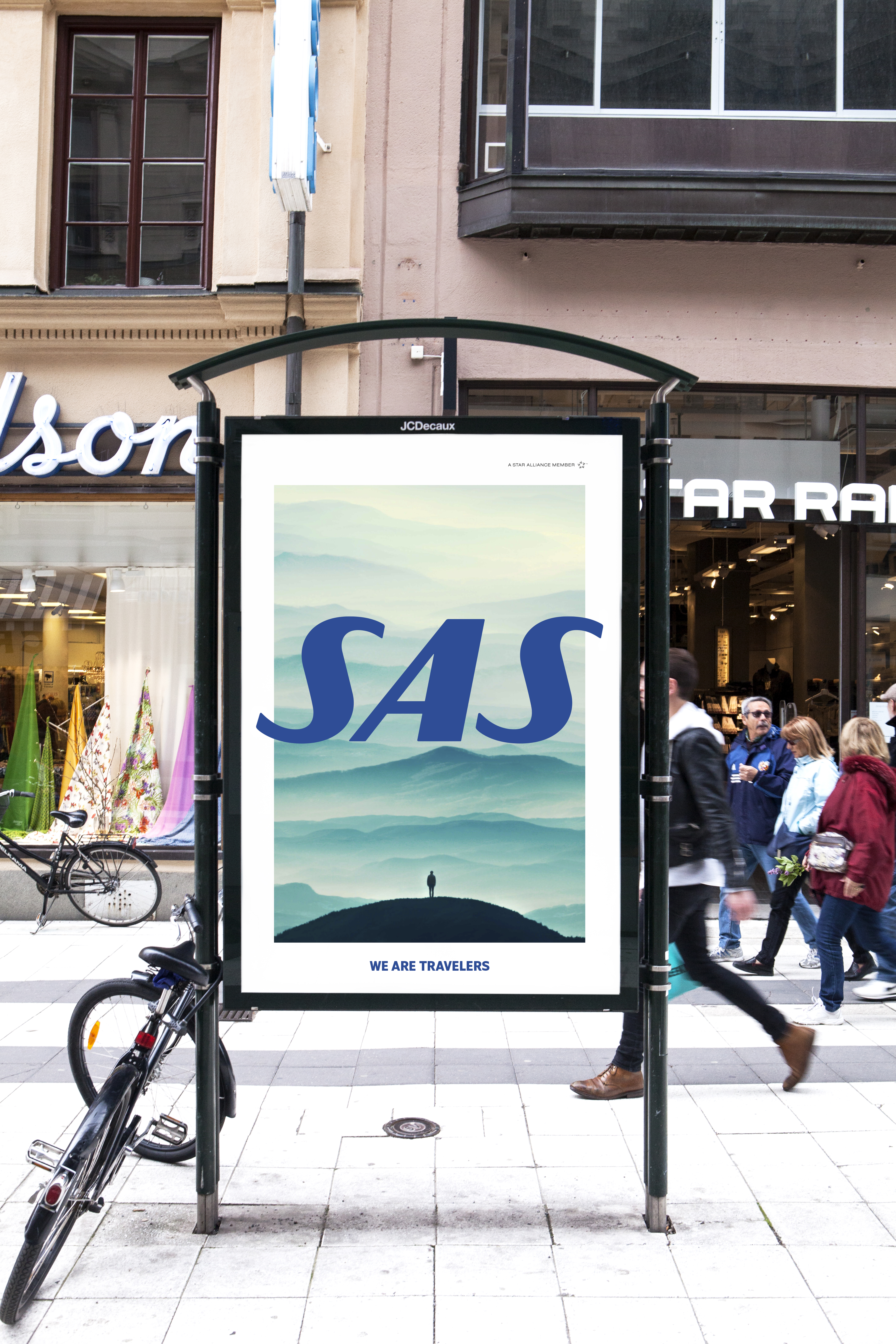
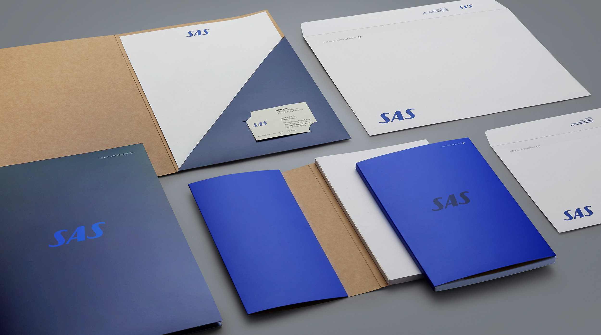
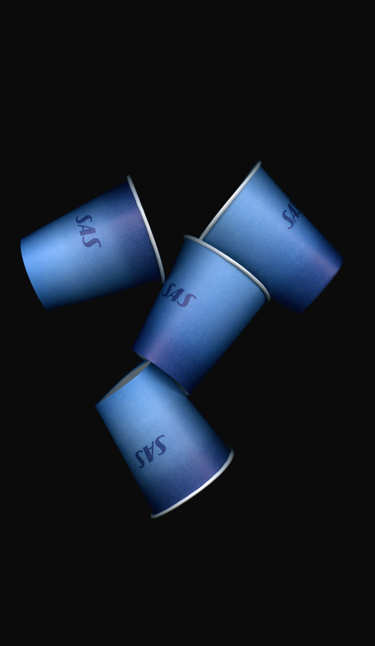
The world of a traveler isn´t simply blue. We created a new color palette including several new shades of blue that allows SAS to works towards taking ownership of the color blue through working with a blue-on-blue color concept.

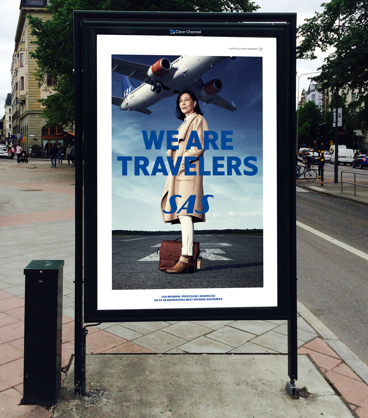
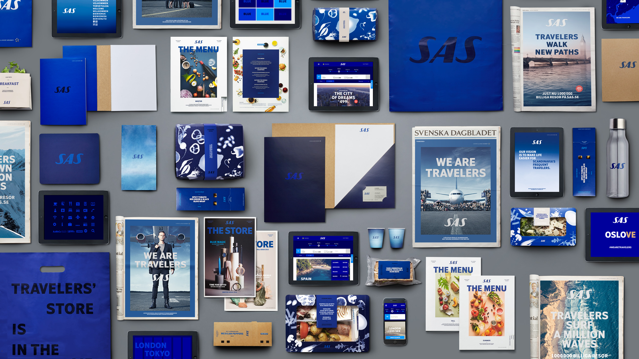
A comprehensive brand identity built for Scandinavias frequent travelers.
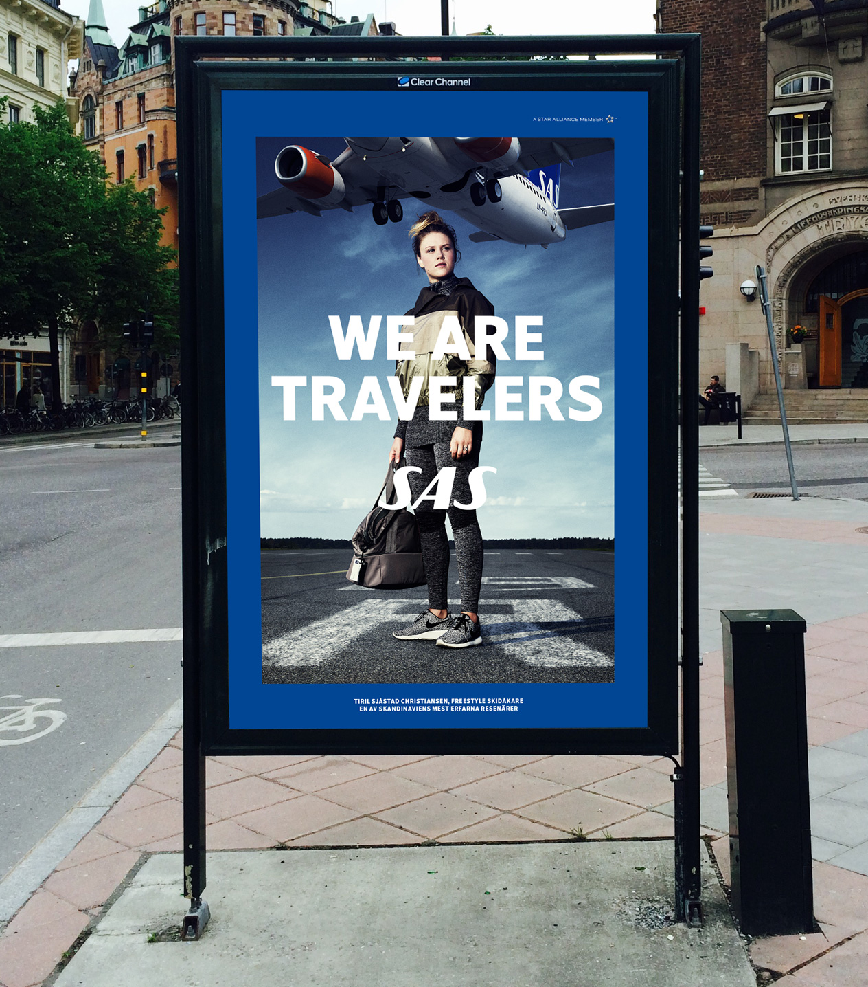
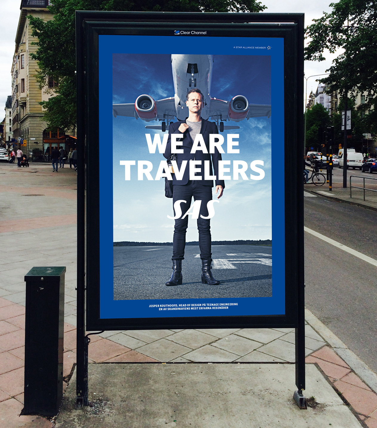
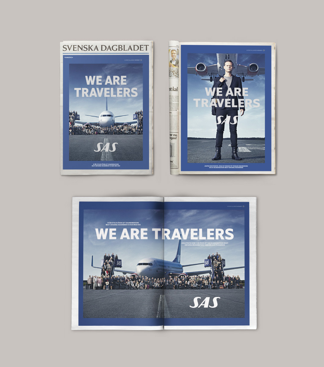
The We Are Travelers campaign was the launch of SAS new strategic position as the choice for the experienced travelers. Broad and proud media was prioritized with a specific focus on clarity, distinctiveness and premium associations.
Photo: Joel Rhodin, MINK MGMT
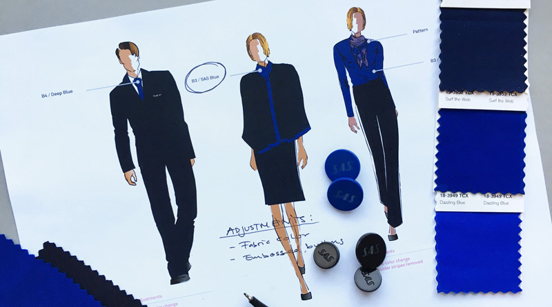
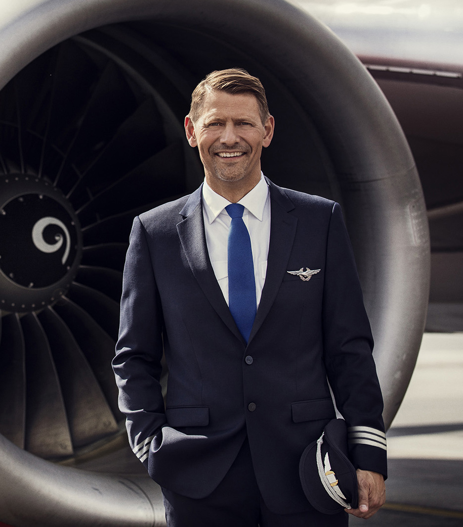
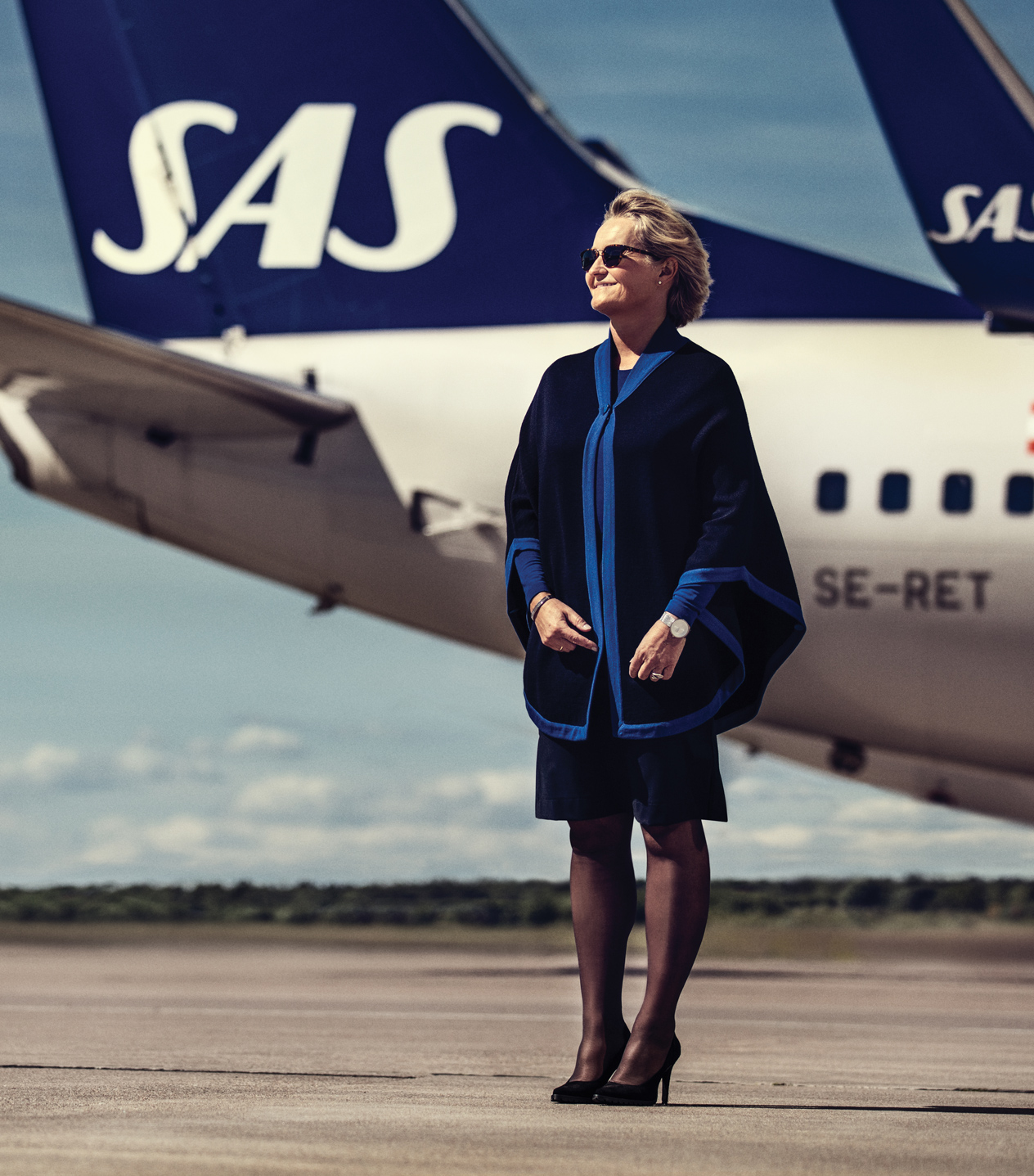
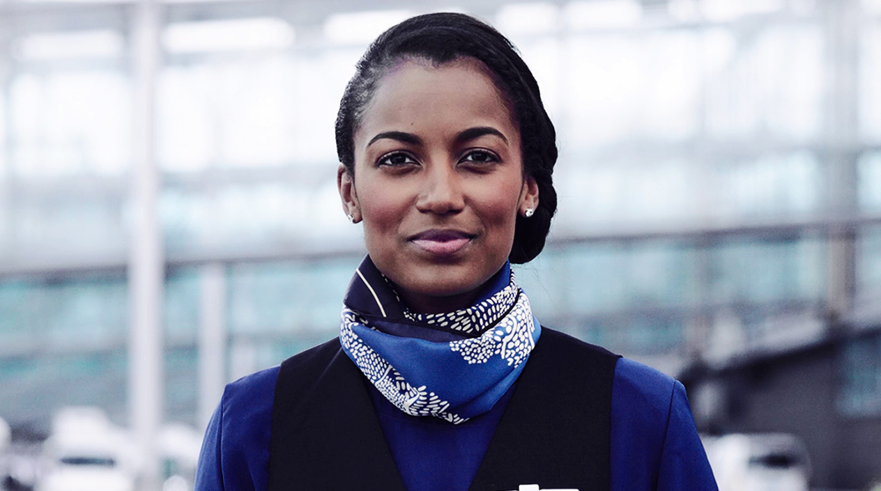
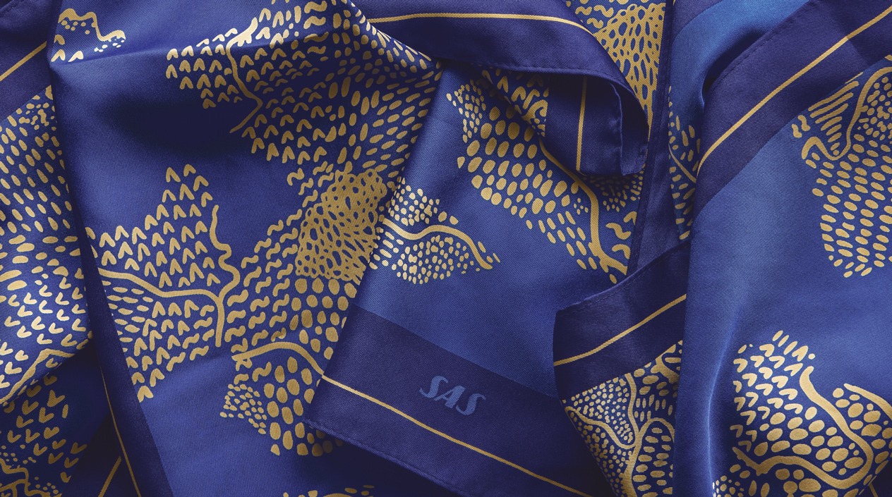
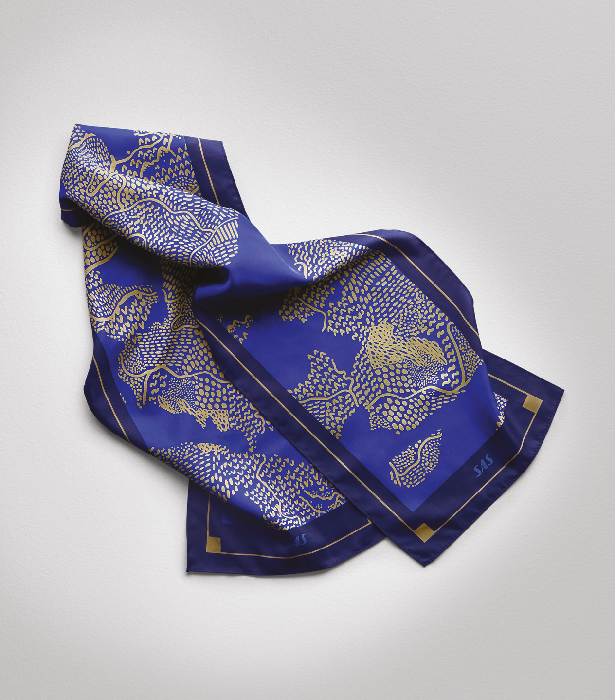
The new uniforms were a collaboration between us and Swedish designer Ted Bernhardtz. The updated uniforms, which include a polo shirt and poncho among other styles, are created to make SAS staff more identifiable for travelers navigating busy international airports.

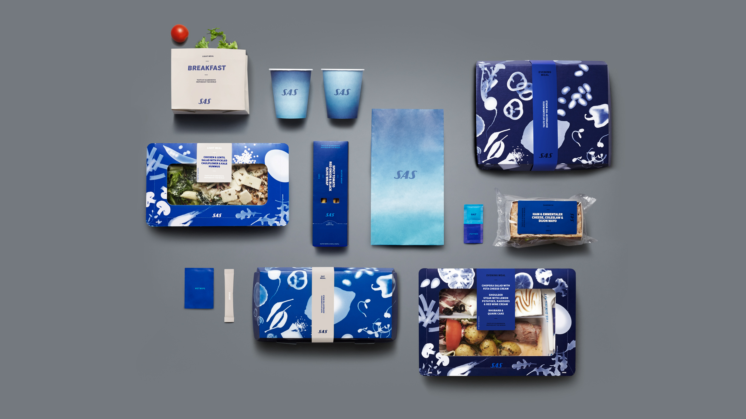
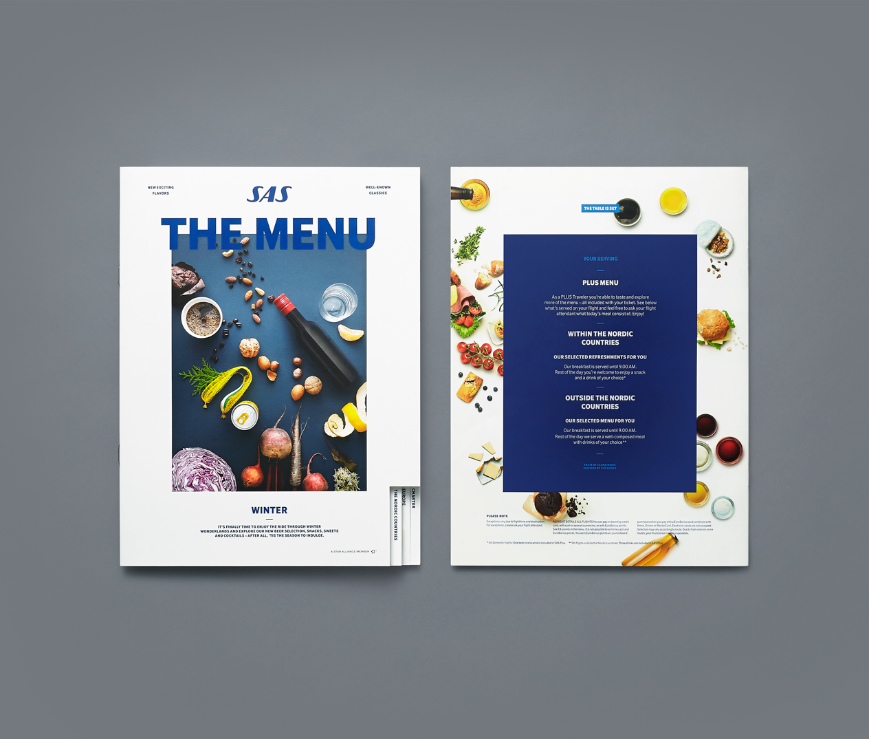
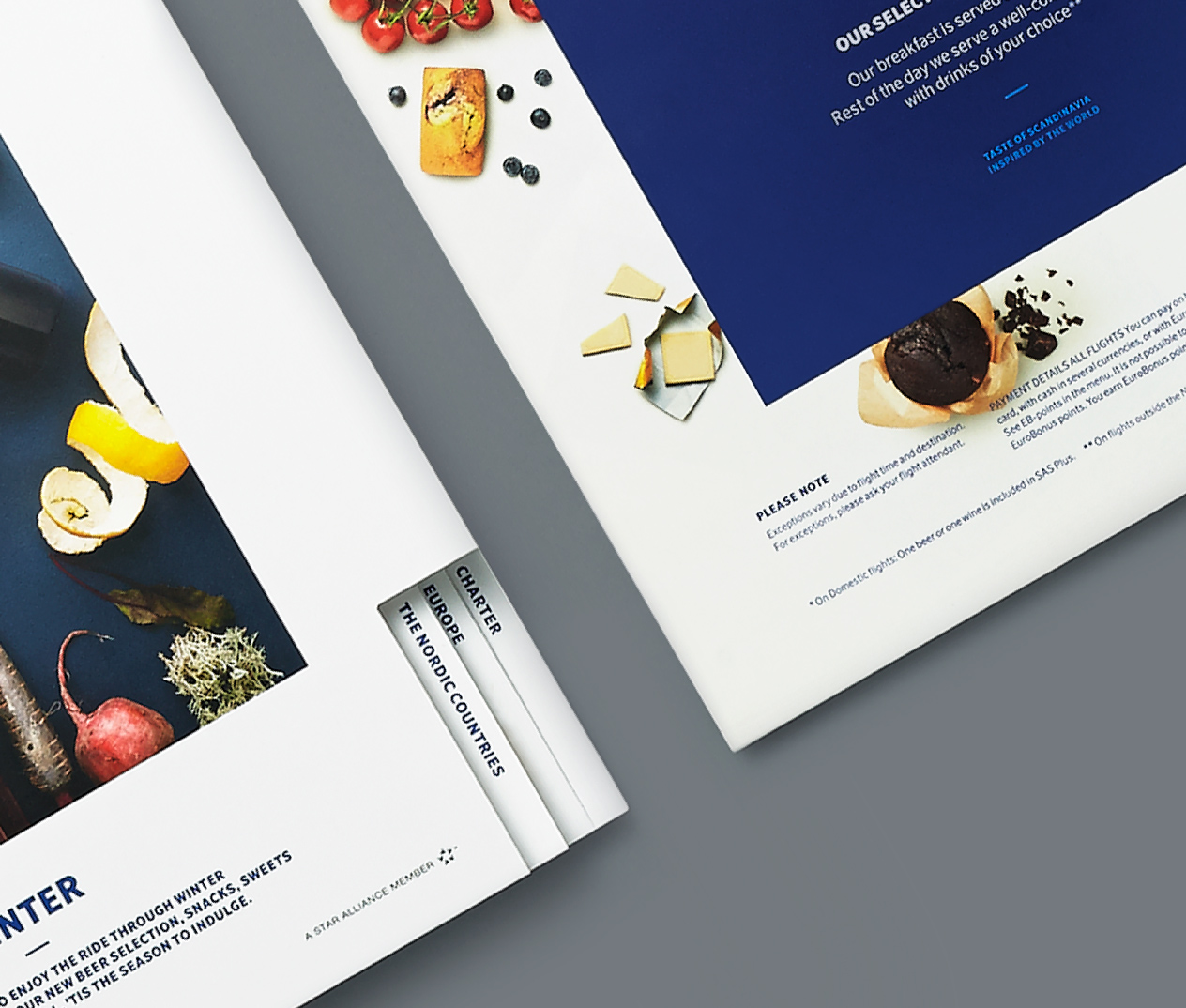
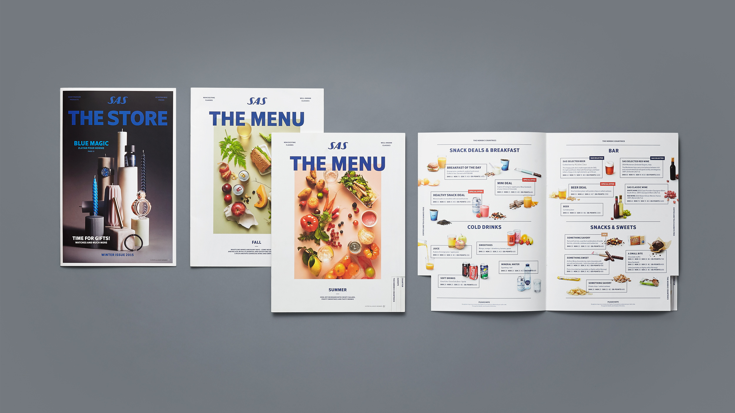
The Menu & Store printed materials draws inspiration from the magazine world. Inspirational and organically arranged photographs with a focus on taste, quality, seasons and products in combination with unexpected objects are presented against monochrome backdrops.