Karl Fazer
The Evolution of a Finnish Icon
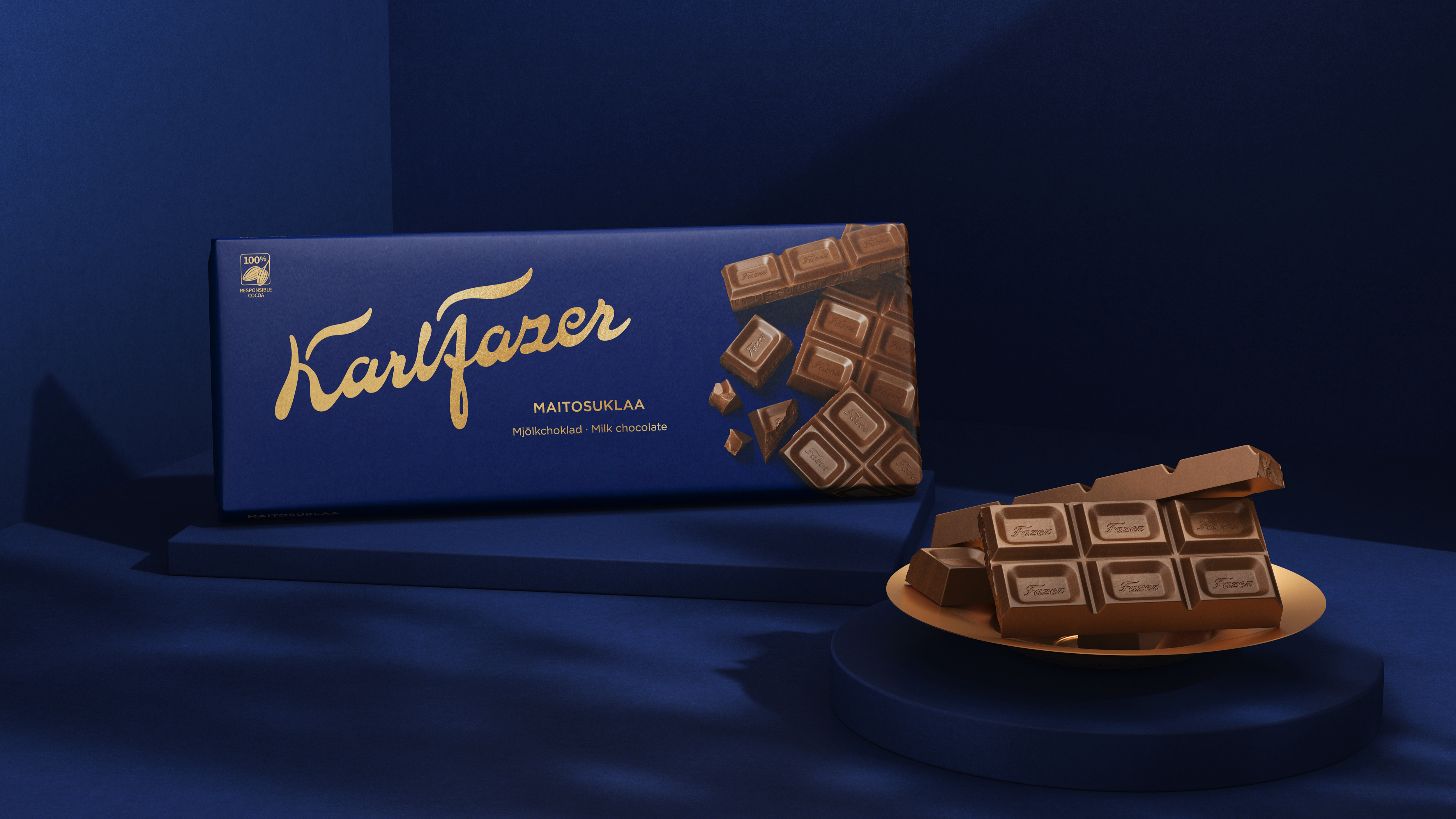
We are proud to share the new visual identity and packaging design for the beloved chocolatier Karl Fazer. The evolution of a true Finnish icon.
Bold were briefed to captivate new audiences with a more modern premium look of indulgence and scalability, while retaining the brand’s most loyal consumers. No small feat. Or, as our client put it: “It has the same dignity as redesigning the Finnish flag.”
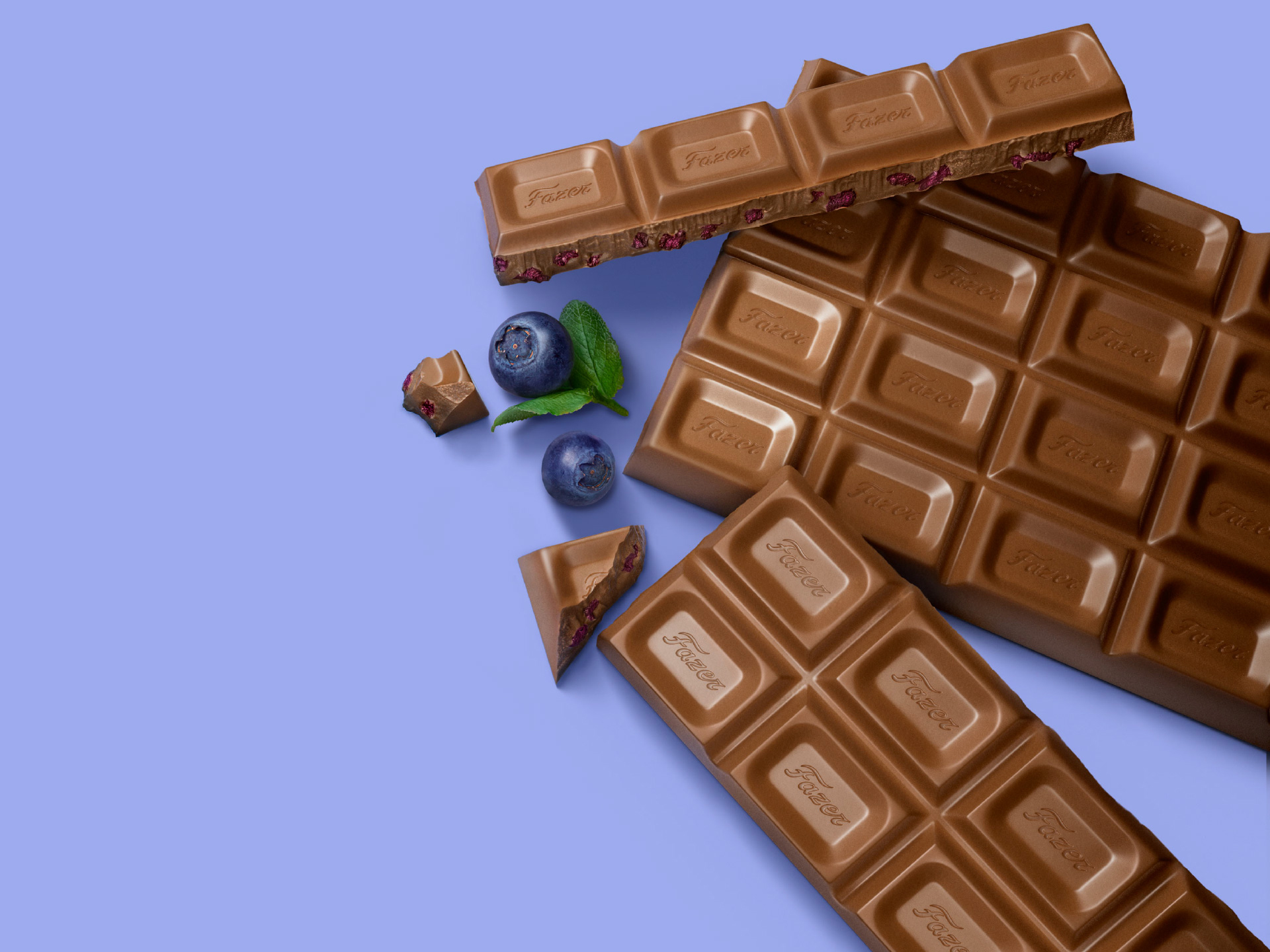
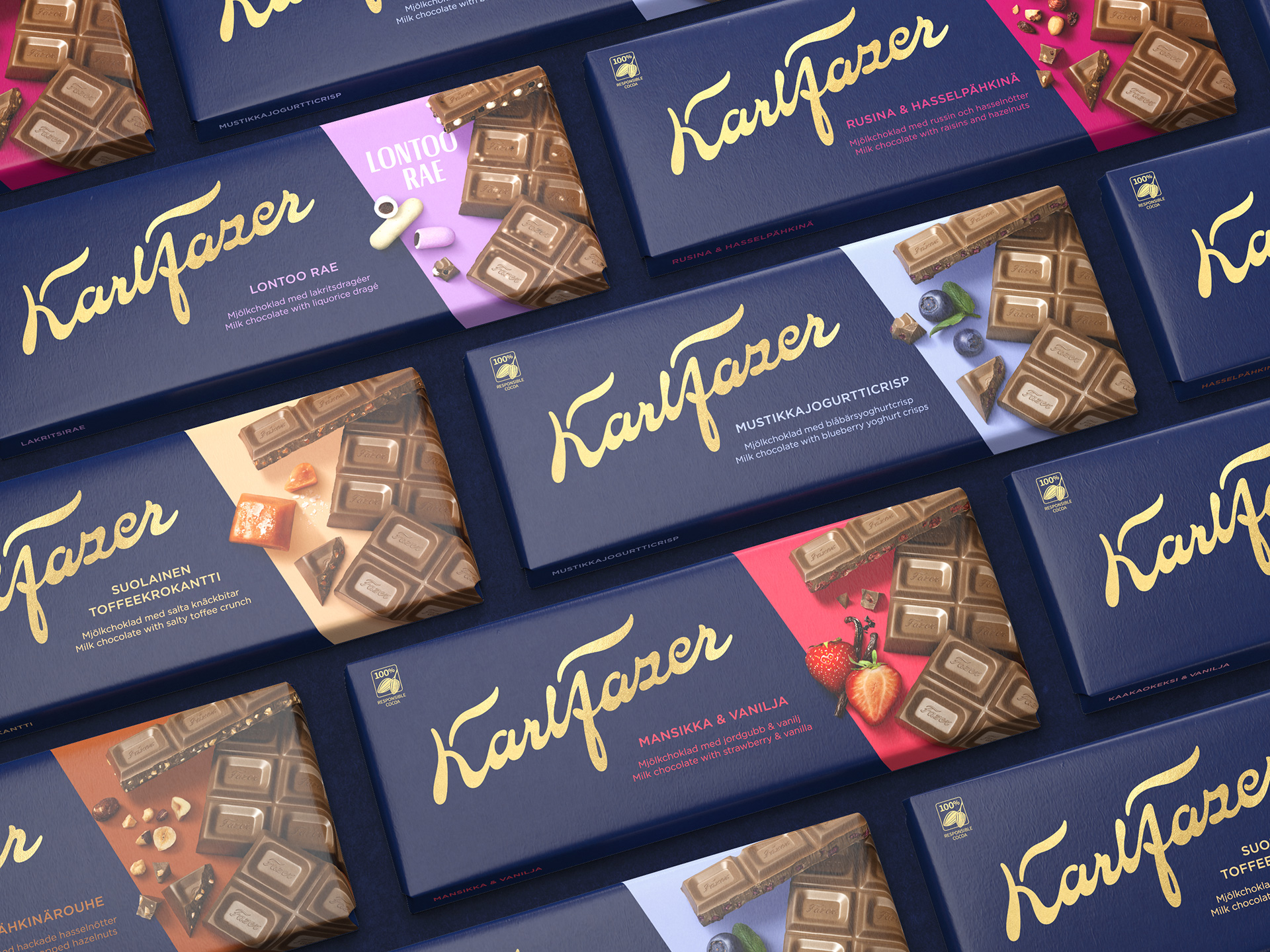
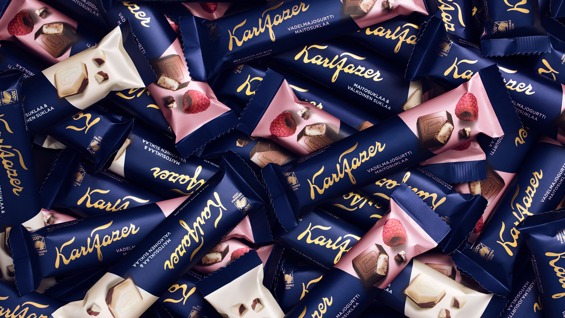
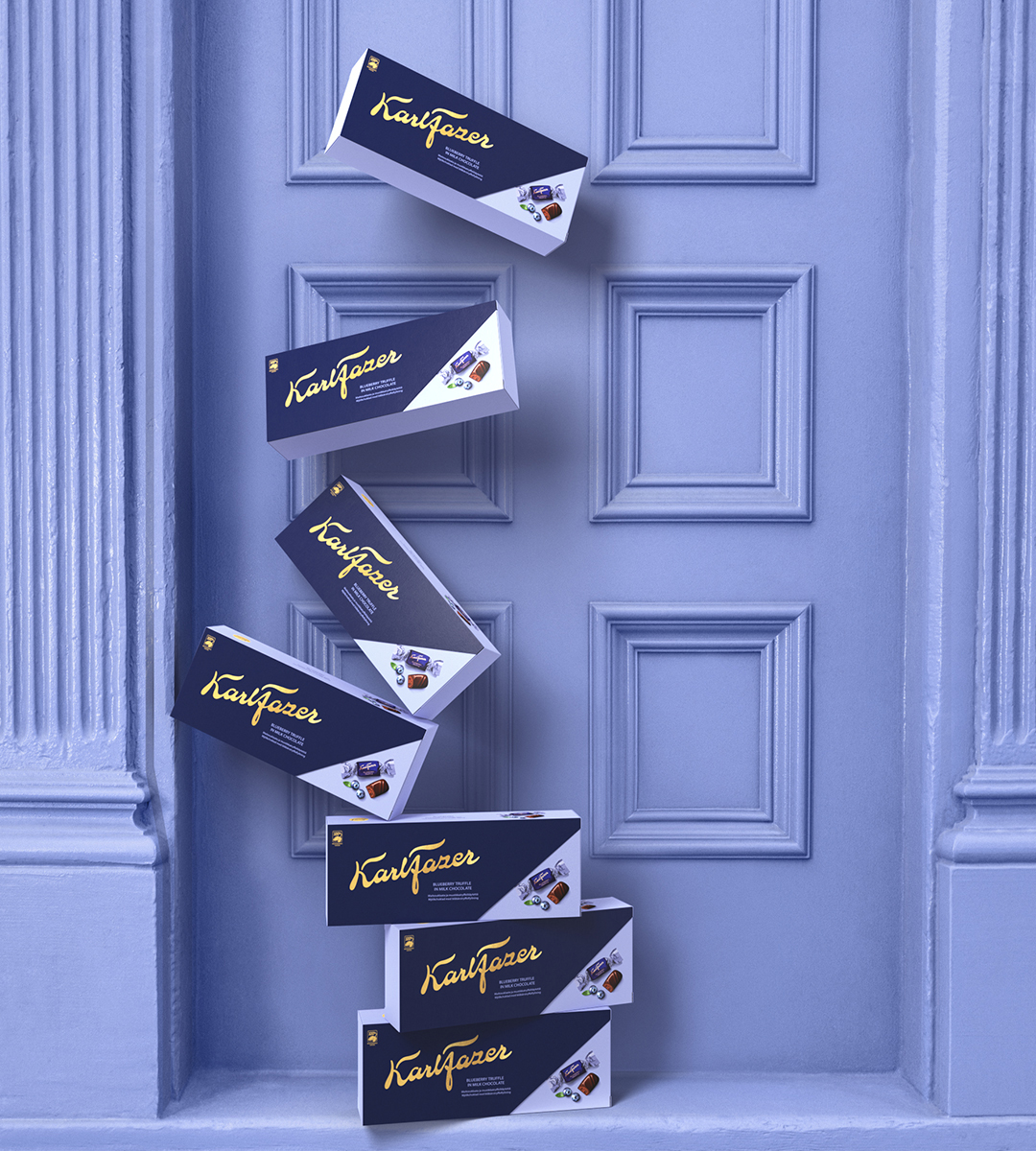
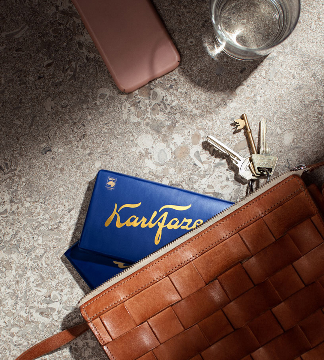
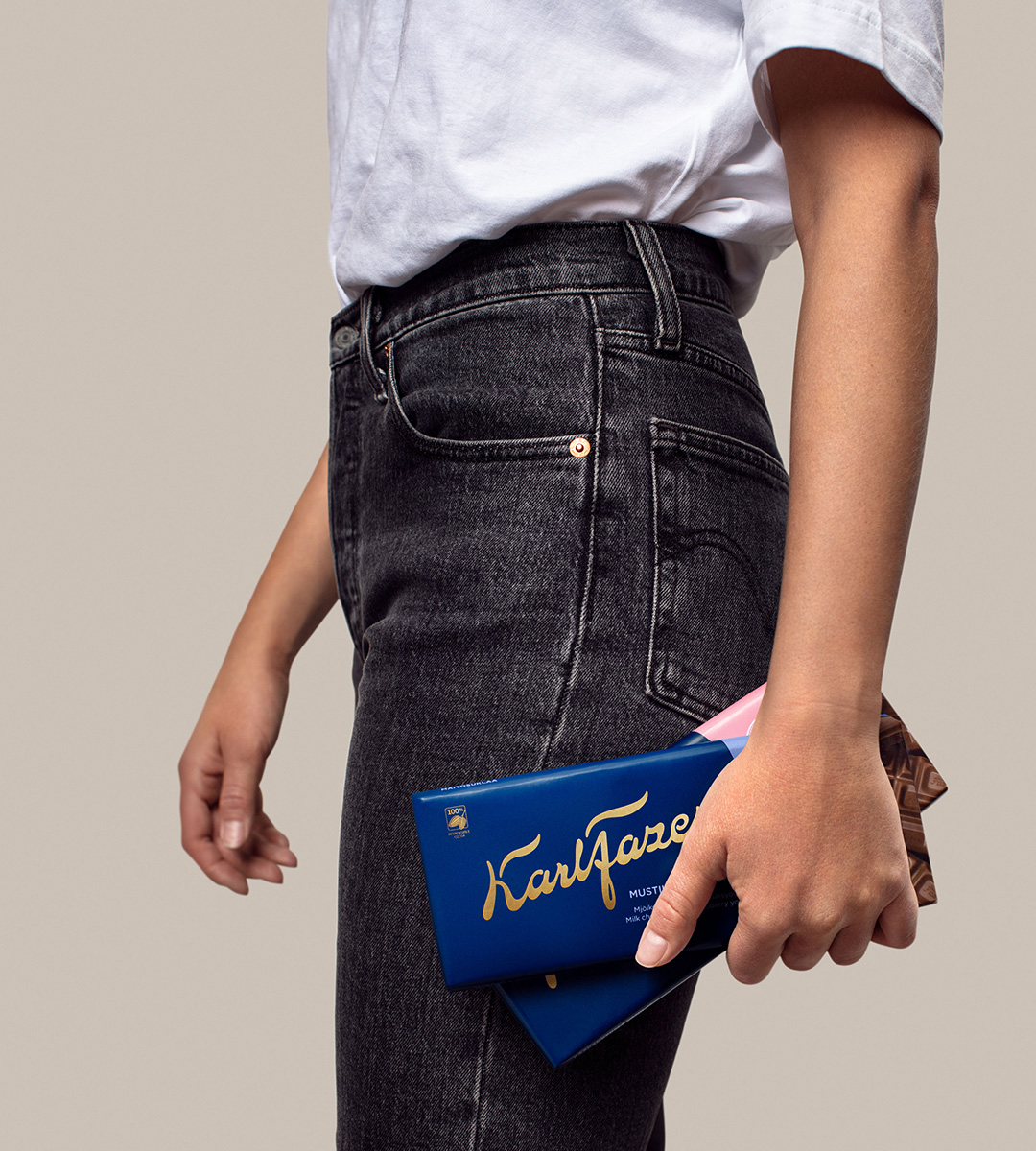
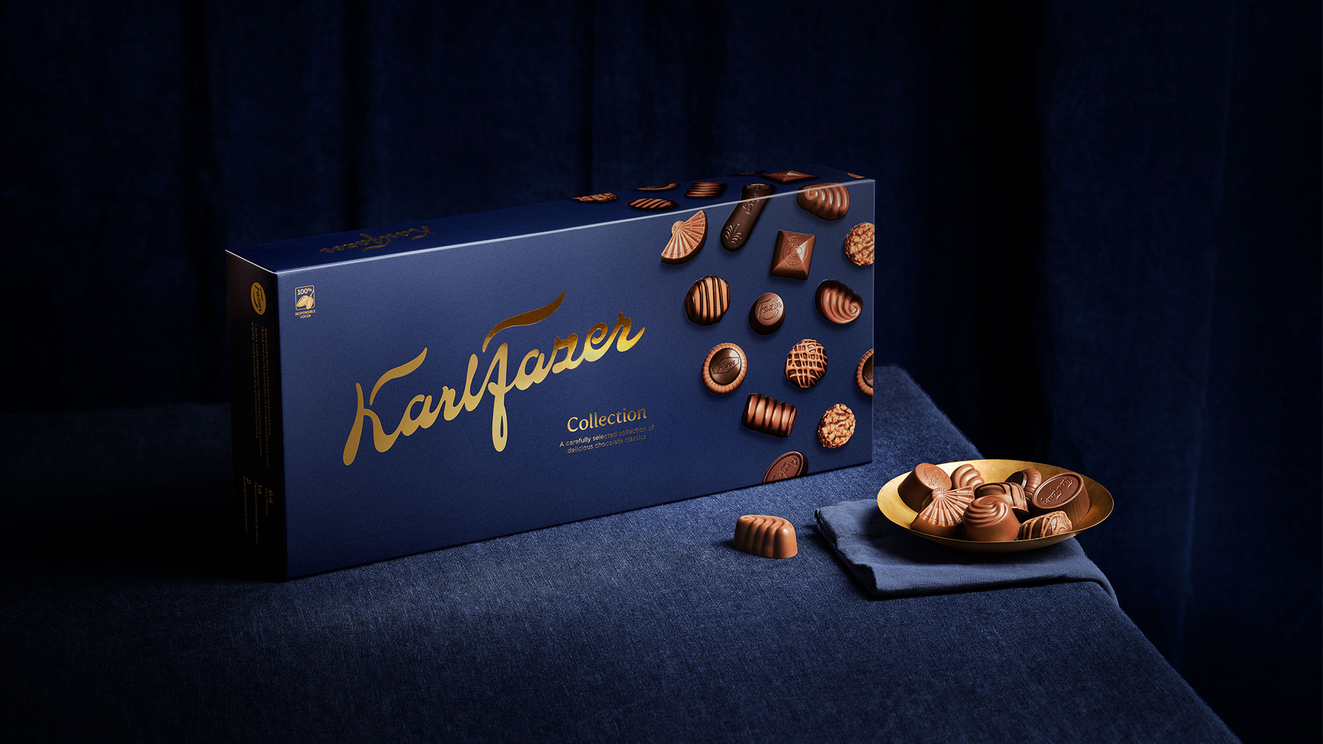
The new packaging design honours the brand story of craftmanship, and the design is developed around the concept of celebrating indulgence and flavours through the visual language. Kindness, people sharing and the sensation of enjoying the moment became the foundation. We thoughtfully evolved the strongest brand assets to create a coherent and distinct visual look throughout the product portfolio.
We also created a new logotype, inspired by the original Karl Fazer signature from 1922. This characteristic link to the actual Karl Fazer heritage enhances the craft and premium visual expression that ties back to the overarching concept and brand position.
The strength of the design is its simplicity. The minimal yet
striking visual elements make it recognisable as well as providing a design system with flexibility and a distinct flavour differentiation.
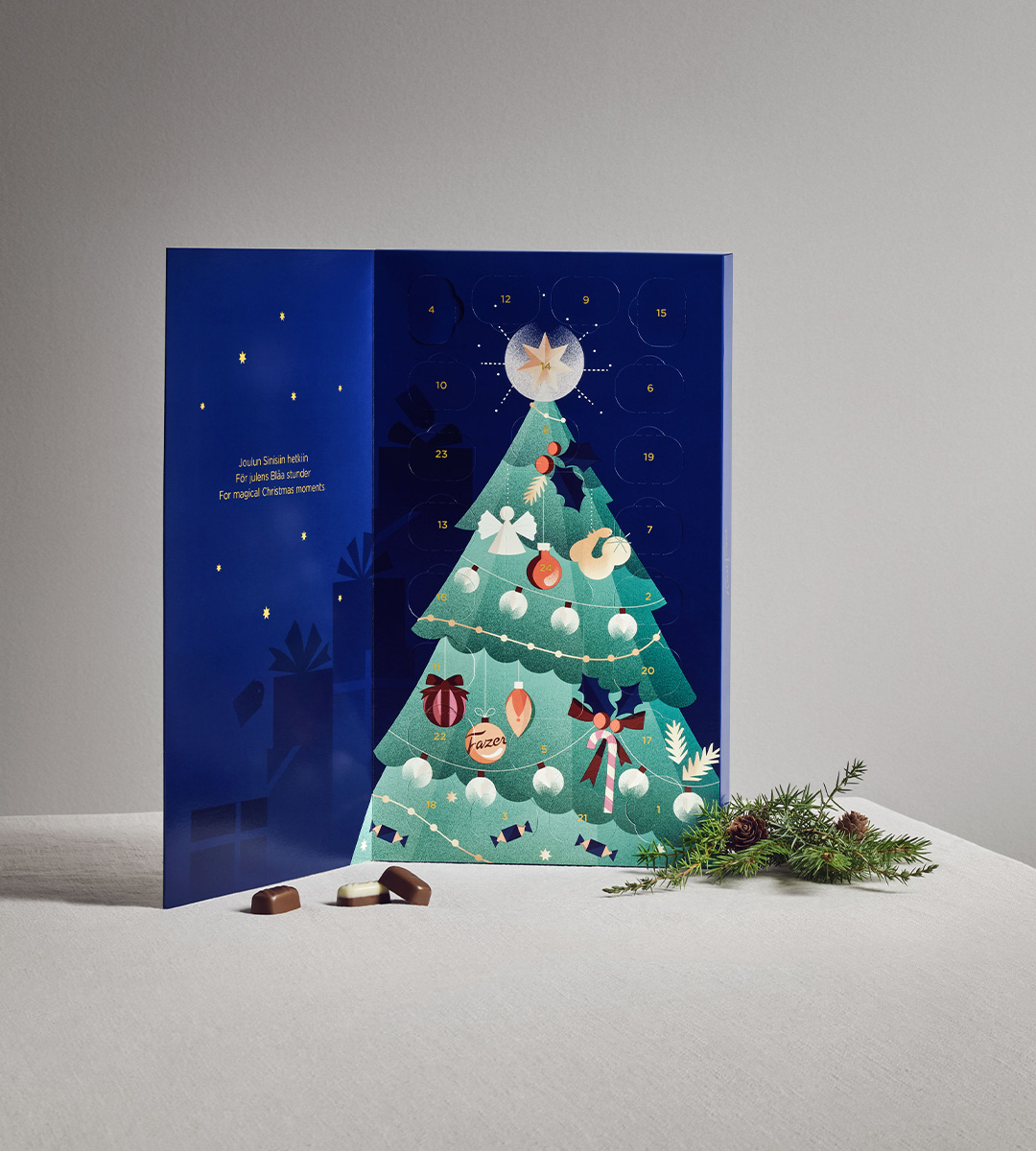
We create the Christmas concept for each year’s Advent Calendar. The 2021 edition
is magically illustrated by Darling Clementine, and highlights the classic sparkling
Christmas excitement.