EQT Ventures
The power of Q
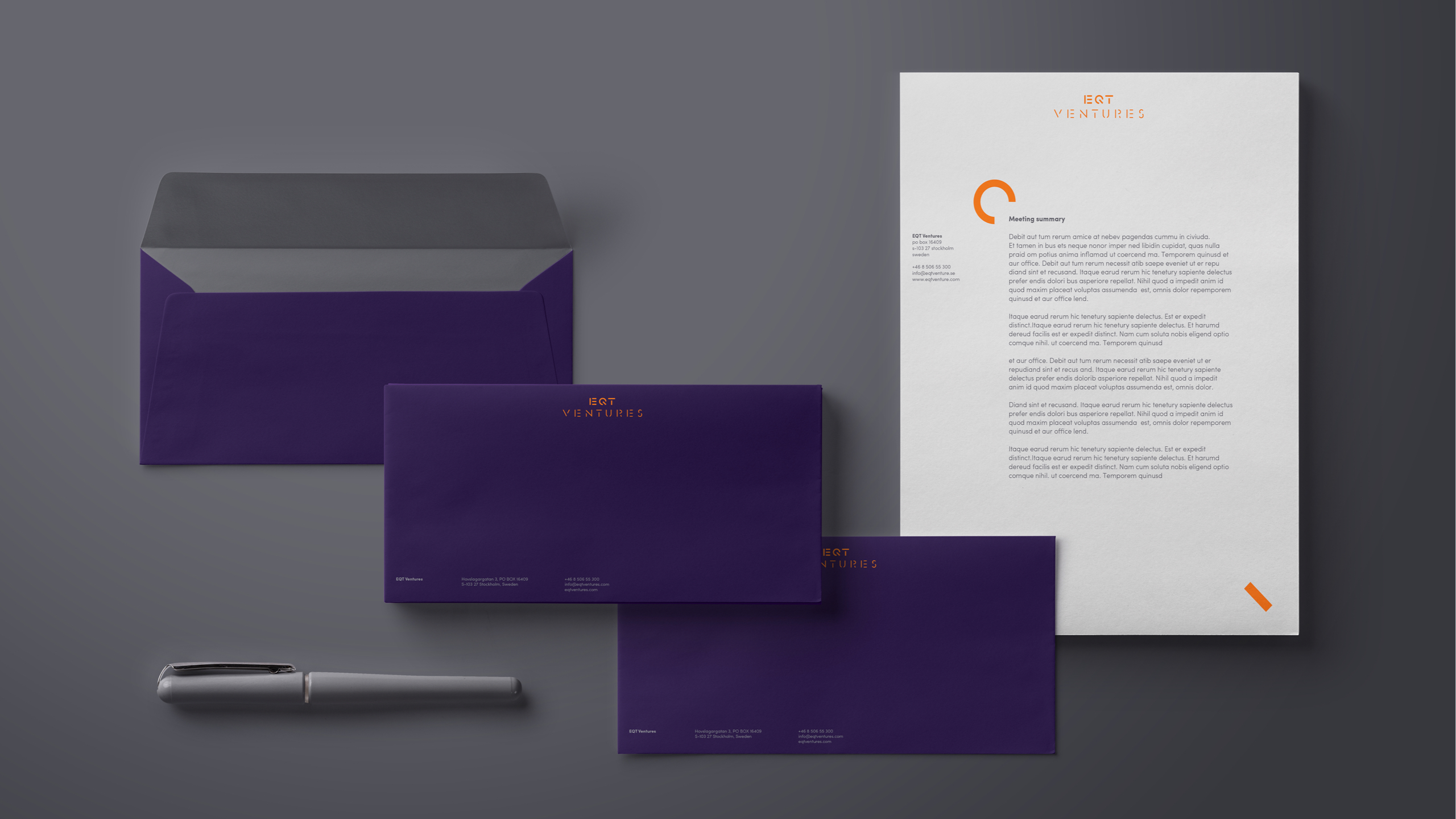
EQT Ventures, one of Europe’s biggest private equity funds, came to us with a task to create an identity that would distinguish them in the highly conservative and corporate space they inhabit. The solution was to capture their energy and creativity in the power of Q – a power button visualised and brought to life by a select group of artists, illustrators and motion designers. The result: goodbye pinstripes, hello future.
EQT Ventures is founded by some of Europe’s most obsessive company builders, engineers, designers, marketeers, computer scientists and scaling experts. They wanted an identity that could distinguish them in the very conservative and corporate space they operate. So we developed an identity that could stick out from all the greyness and pinstripes – something that could capture the same amount of energy and creativity as the startups they finance.
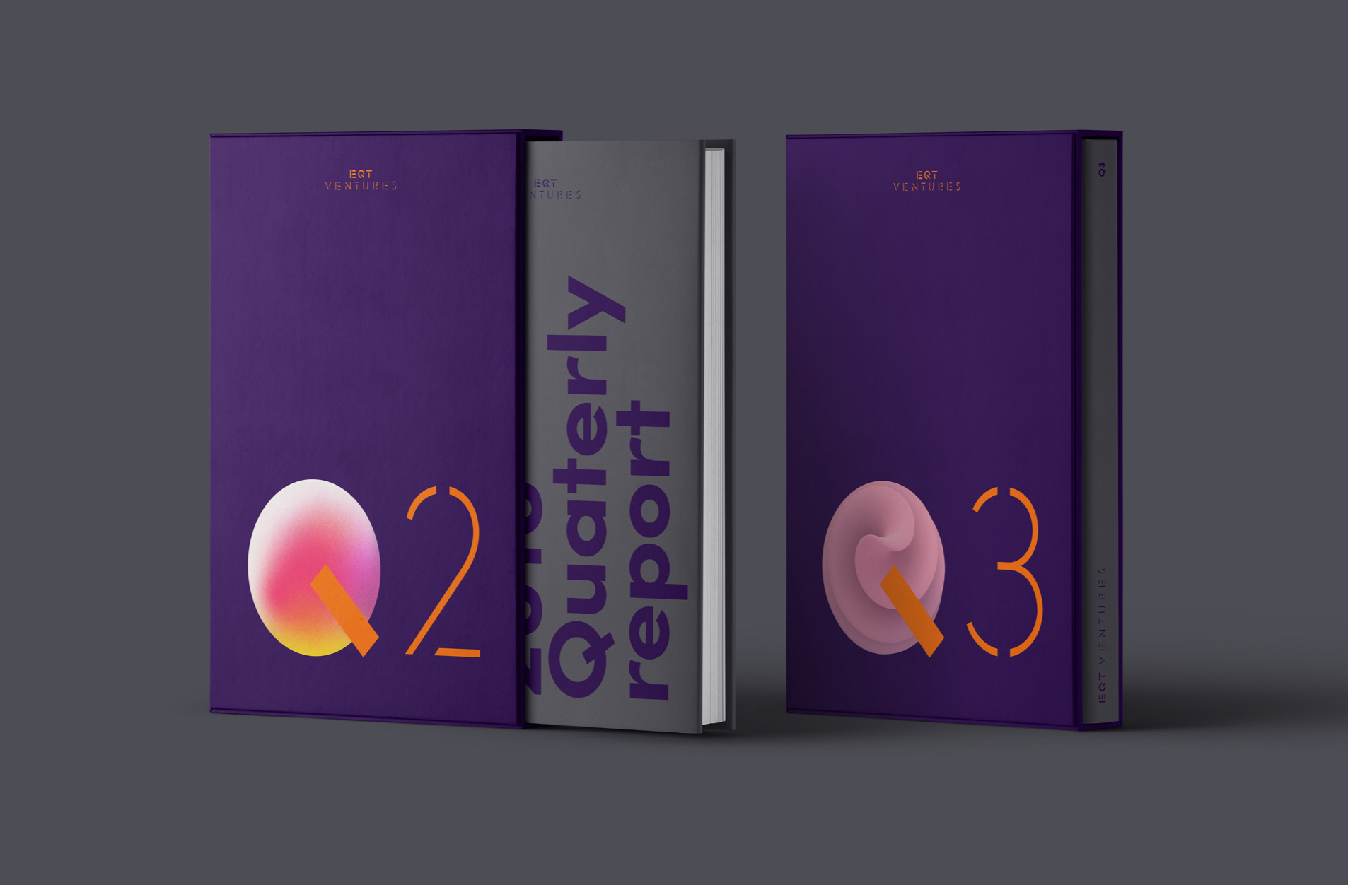
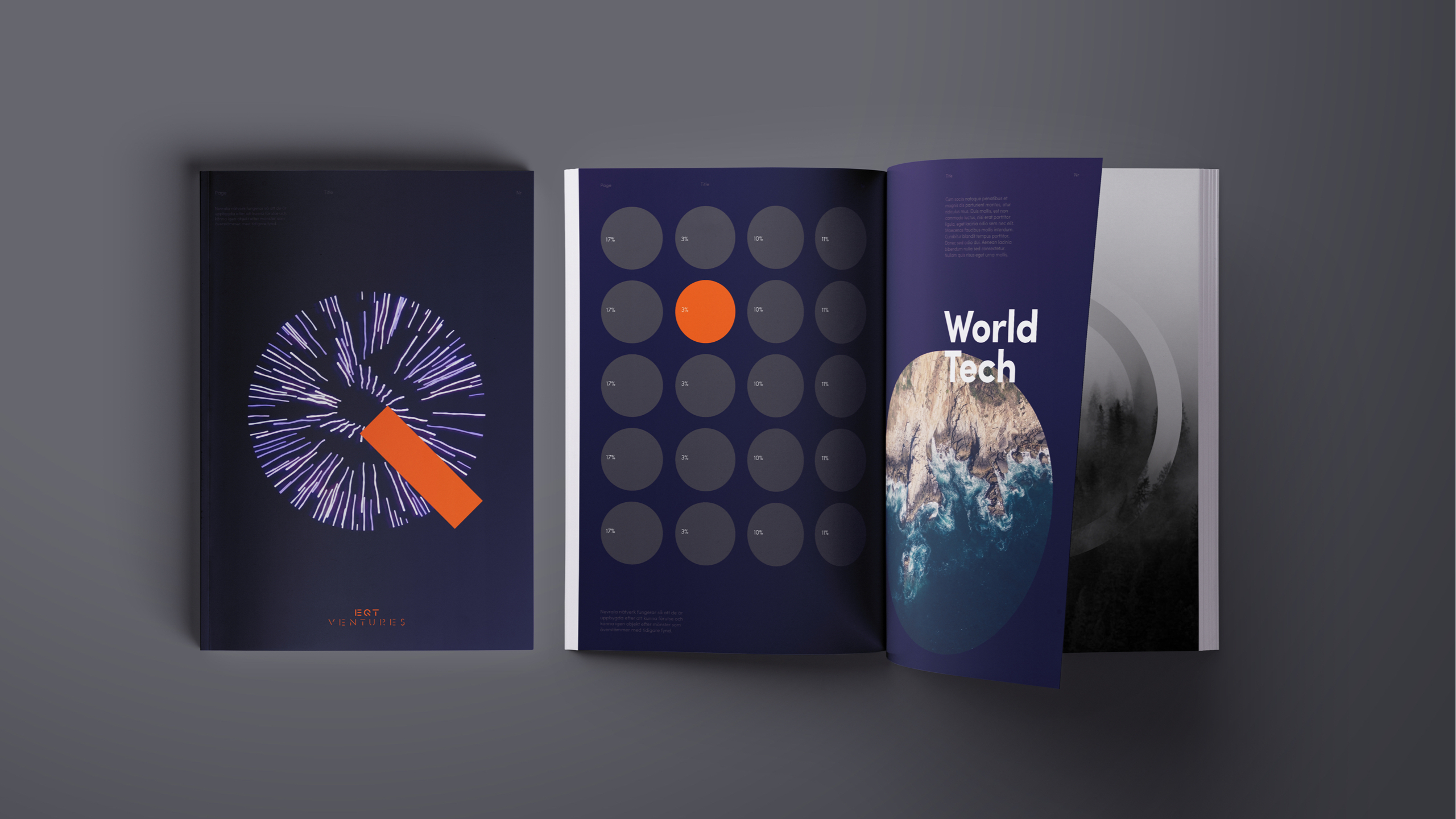
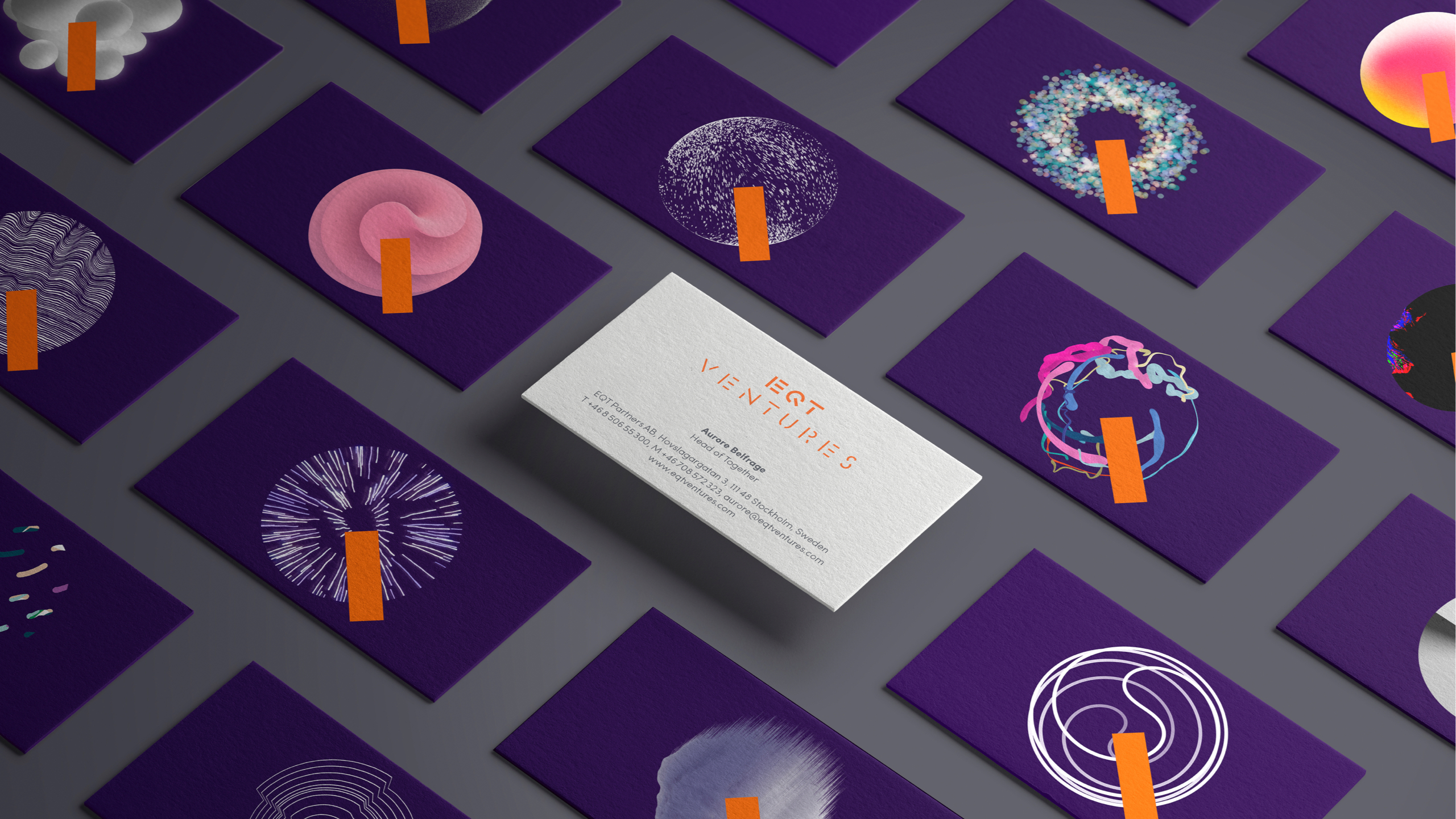
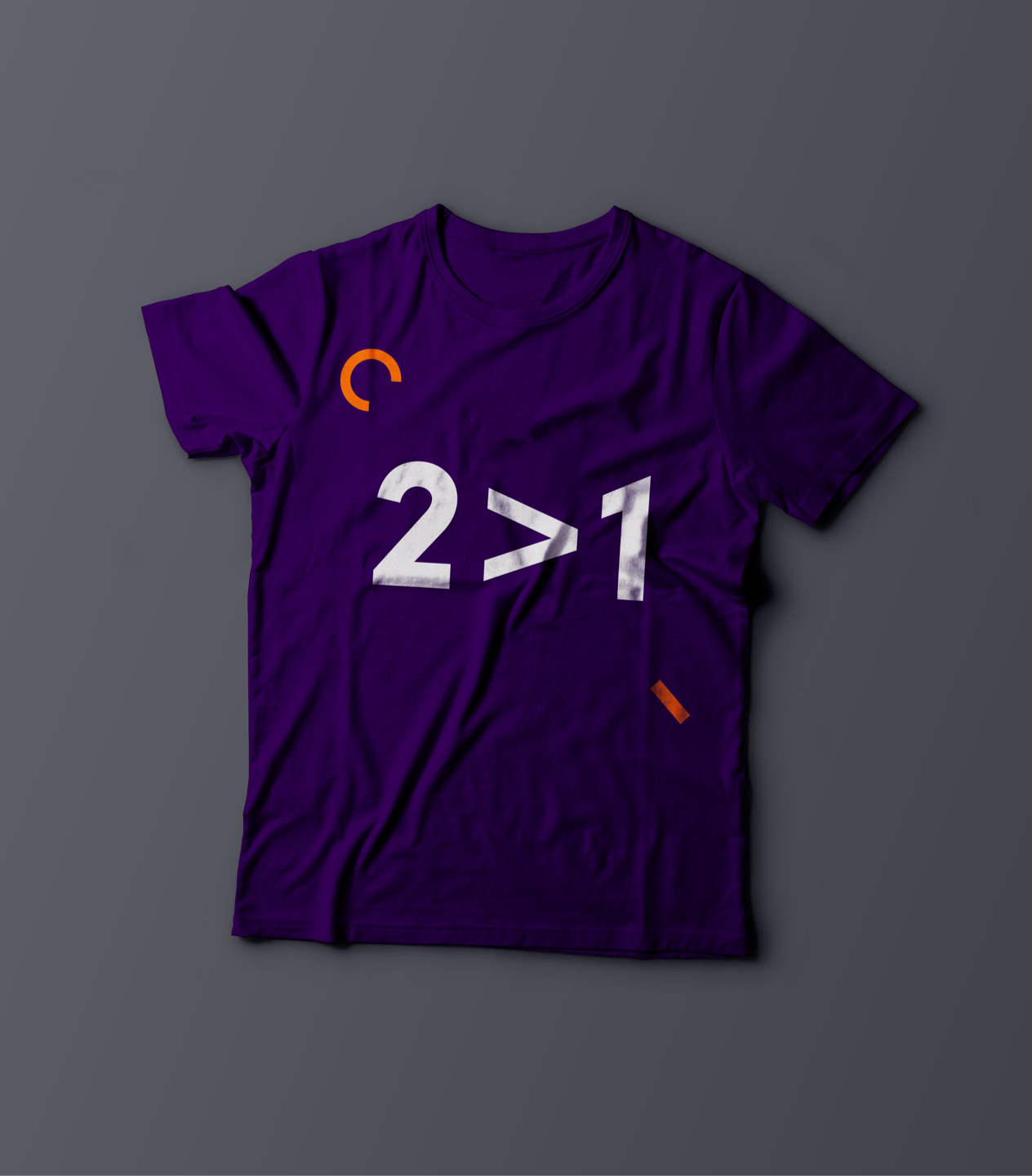
The design concept is based on letting the Q from the logotype become a power button, symbolising what happens when EQT Ventures gets involved. That´s when the journey begins. The power Q is visualised in many different styles and techniques symbolising each new cooperation.




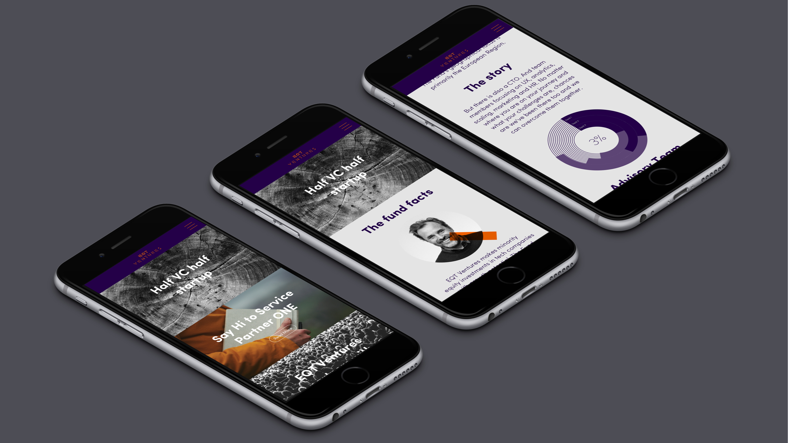
"Our visual identity is exactly in line with what EQT Ventures is, which has made it easy for us to express to external parties what we stand for and how we want to differentiate ourselves."
